Premier League Injury Risk Dashboard (2022–2025)
Overview
As a soccer fan, I was curious: can we spot which players might get hurt based on age, position, or how much they play? I dug into injury data from 2022 to 2025 and built this Tableau dashboard to explore it. You can filter by team, position, or player attributes and see how they relate to injury patterns. It's not perfect—injuries are messy—but it's fun to see what the data says.
Interactive Tableau Dashboard
Use the toolbar to zoom and interact. Click the fullscreen icon for best view.
Individual Chart Visualizations
I broke down the dashboard into individual charts so you can see each visualization in detail. Click on any chart below to view it in full size:
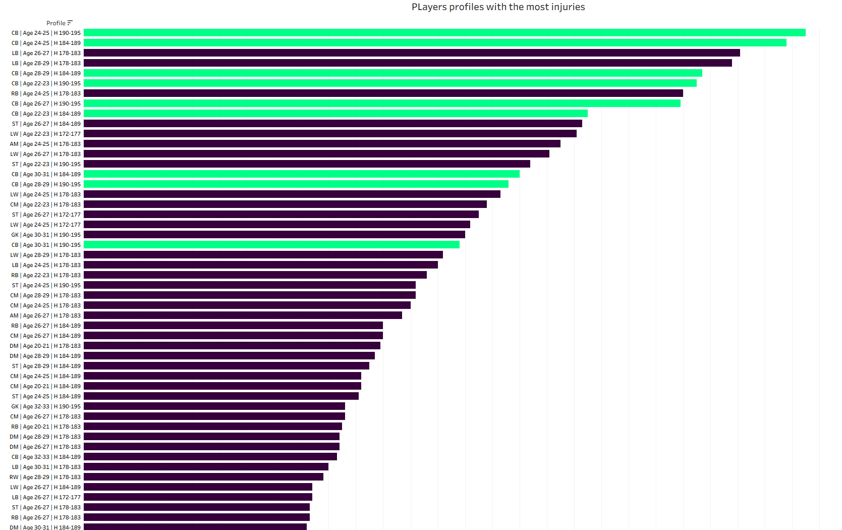
Players Profiles with the Most Injuries
I built this horizontal bar chart to compare player profiles by total injuries, using position, age range, and height. It highlights that centre-backs aged 24–31 and 184–189 cm are the group with the most injuries.
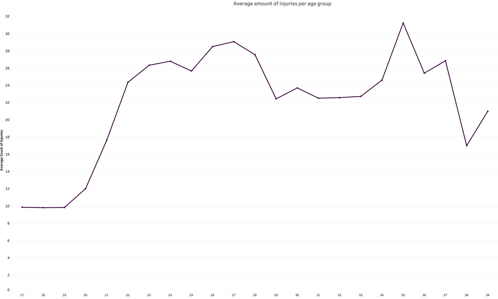
Average Amount of Injuries per Age Group
I created this line chart to track how injuries change across age groups. It shows a sustained peak in injuries between ages 22–30, with another noticeable spike around age 35.
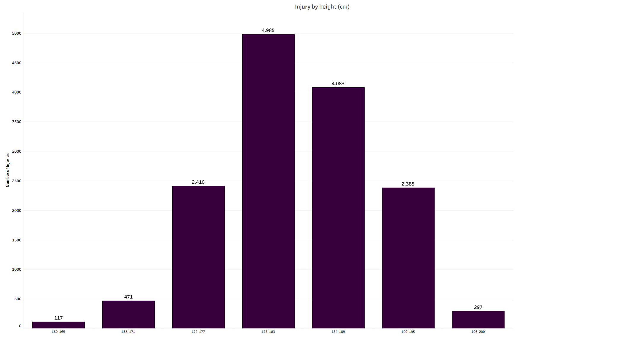
Injury by Height (cm)
I used this bar chart to explore how injury risk varies by height. It reveals that players between 178–189 cm have the most injuries overall, with the 178–183 cm range standing out as the peak.
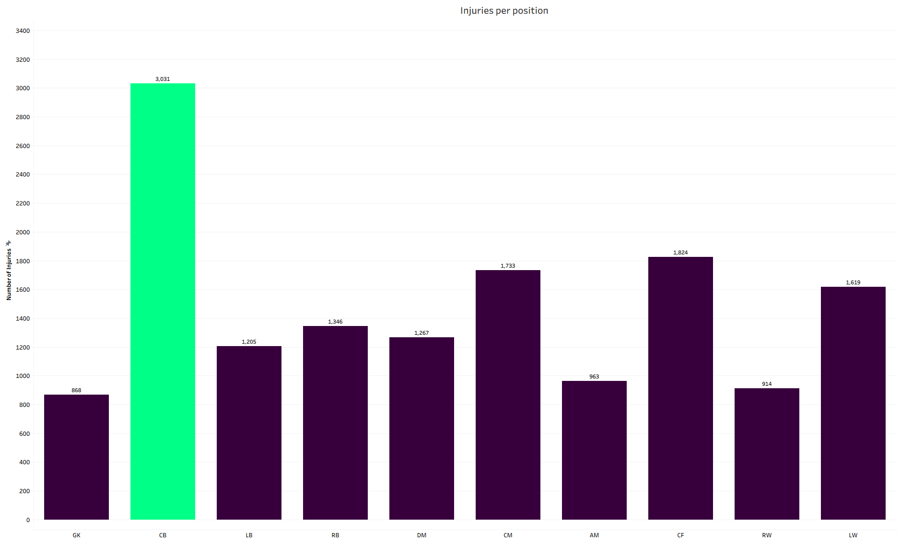
Injuries per Position
I designed this bar chart to compare injuries across all positions. It makes it clear that centre-backs are the most affected, with 3,031 injuries—far more than any other role.
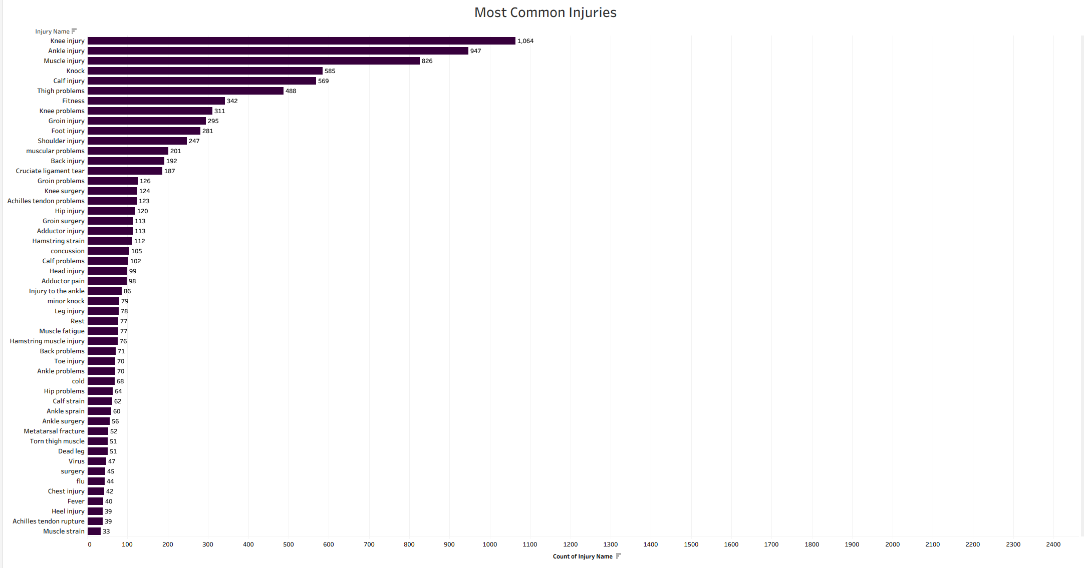
Most Common Injuries
I built this horizontal bar chart to rank injury types by how often they occur. It shows that knee injuries, ankle injuries, and muscle injuries are the three most frequent issues players face.
About the Charts
I created several different visualizations to explore different aspects of injury data:
- Injury Risk by Player Position: I analyzed how different playing positions correlate with injury frequency and severity to identify which roles are most vulnerable.
- Age vs. Injury Patterns: I visualized the relationship between player age and injury occurrence to see how injury risk changes throughout a player's career.
- Injury by Height: I looked at how player height relates to injury rates to see if certain physical builds are more prone to injuries.
- Most Common Injuries: I tracked which types of injuries occur most frequently to understand what players are dealing with.
- Player Profiles: I combined position, age, and height to create profiles that show which combinations of attributes lead to the highest injury counts.
Key Insights
Here's what I discovered from analyzing the data:
- Centre-backs are the most injury-prone position: I found that centre-backs have over 3,000 injuries, which is significantly higher than any other position. The data shows that tall centre-backs aged 22-31 are especially at risk—they make up 7 out of 11 of the most injured player profiles.
- Player height correlates with injury risk: I noticed that players in the mid-to-tall height ranges (178-189 cm) account for most injuries. The 178-183 cm range has the highest count at 4,985 injuries, which suggests that certain physical builds might be more susceptible to getting hurt.
- Injury risk peaks at specific career stages: I discovered that injury rates are consistently high for players in their early to late twenties (22-30), with injuries hitting a peak during this period. There's also another significant surge around age 35, which highlights critical periods in a player's career where injury prevention strategies might be most important.